Aim
As Matt mentioned in Our Approach to Homebrew, we are both very visual people, we are also fortunate to have strong backgrounds in graphic design and illustration respectively, and we are constantly pushing ourselves to get better at our craft.
Our goal is to provide the community with fun tools and content to enhance their experience, and we feel a key part of that is to make our content visually appealing.
My personal goal is to pour all the art knowledge I’ve acquired over the years into each and every illustration I make, while continuing to push my boundaries and challenge myself out of my comfort zone. To put it bluntly, “good enough” is never going to be good enough, even if I’m just painting a stain on a wall I will make sure it’s the best darn stain I can possibly paint.
Route
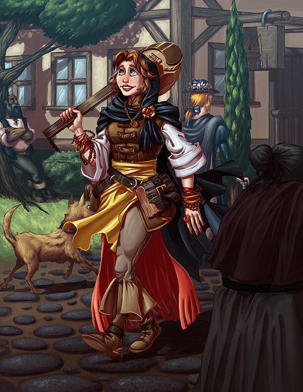
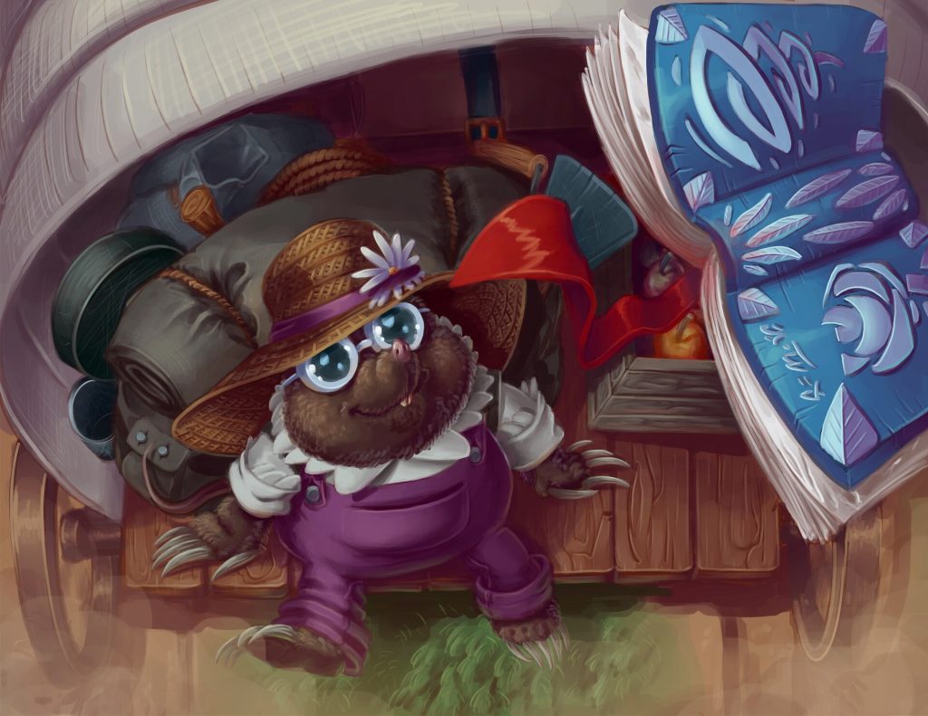
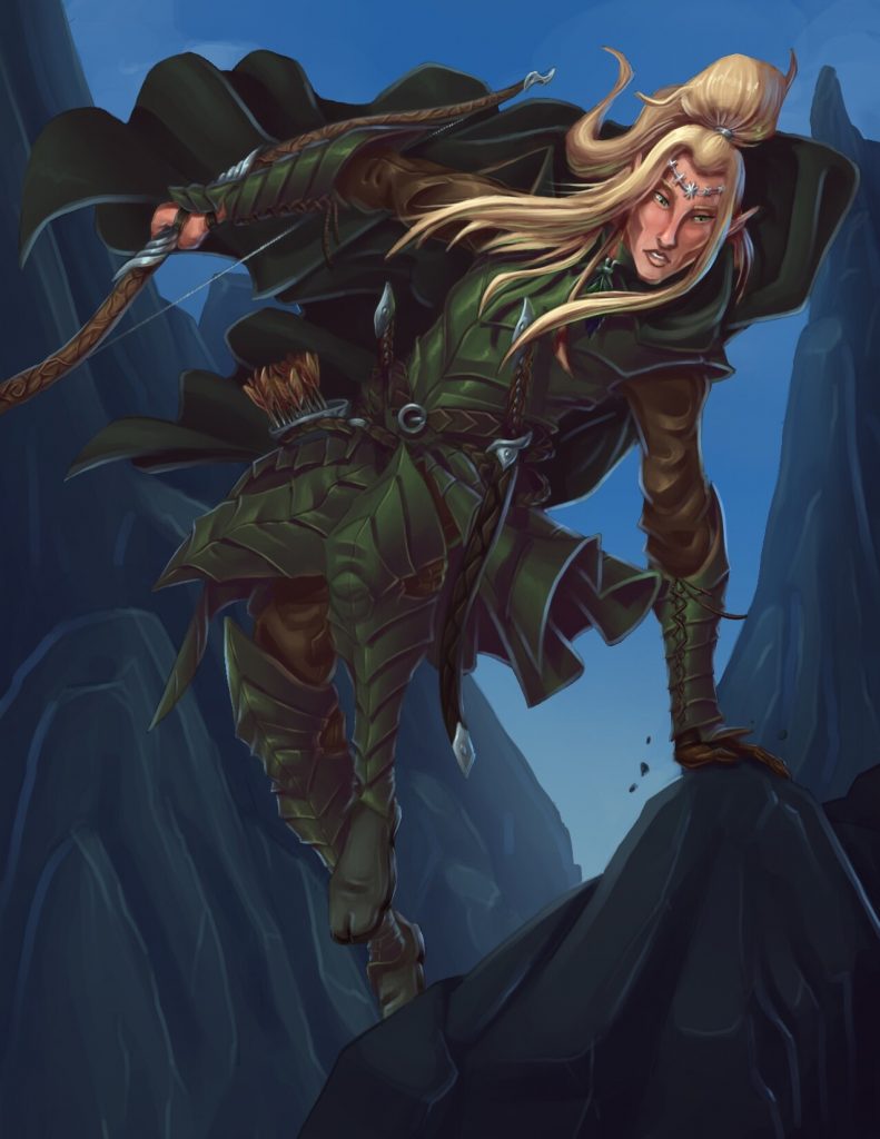
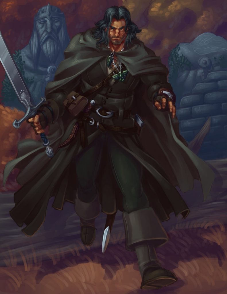
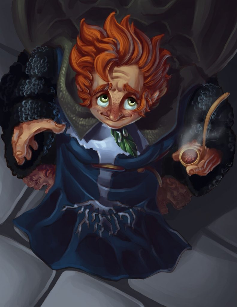
Establishing an art direction (or visual style) is an important part of every project; do we want our content to look Grim Dark or Cartoony? Painterly or Comic Book? I believe the path does not have to be a linear one. Some of the stuff we release will call for somber, serious scenes with the subjects showing lots of emotion; some other content will be more lighthearted, even humorous and will call for more carefree, happy scenes. Sometimes the art can help bring a bit of levity to an otherwise very serious system.
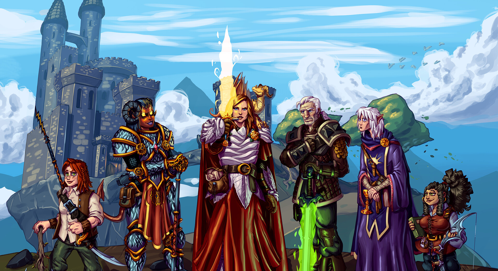
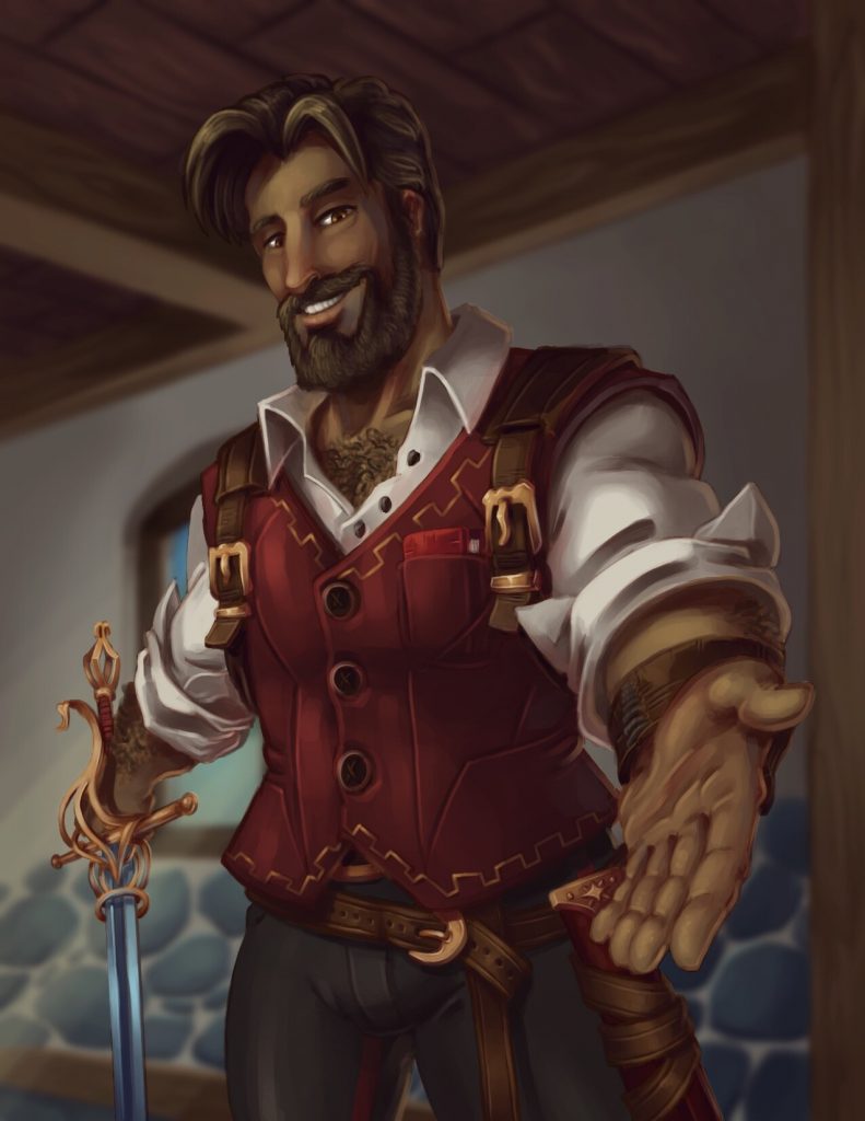
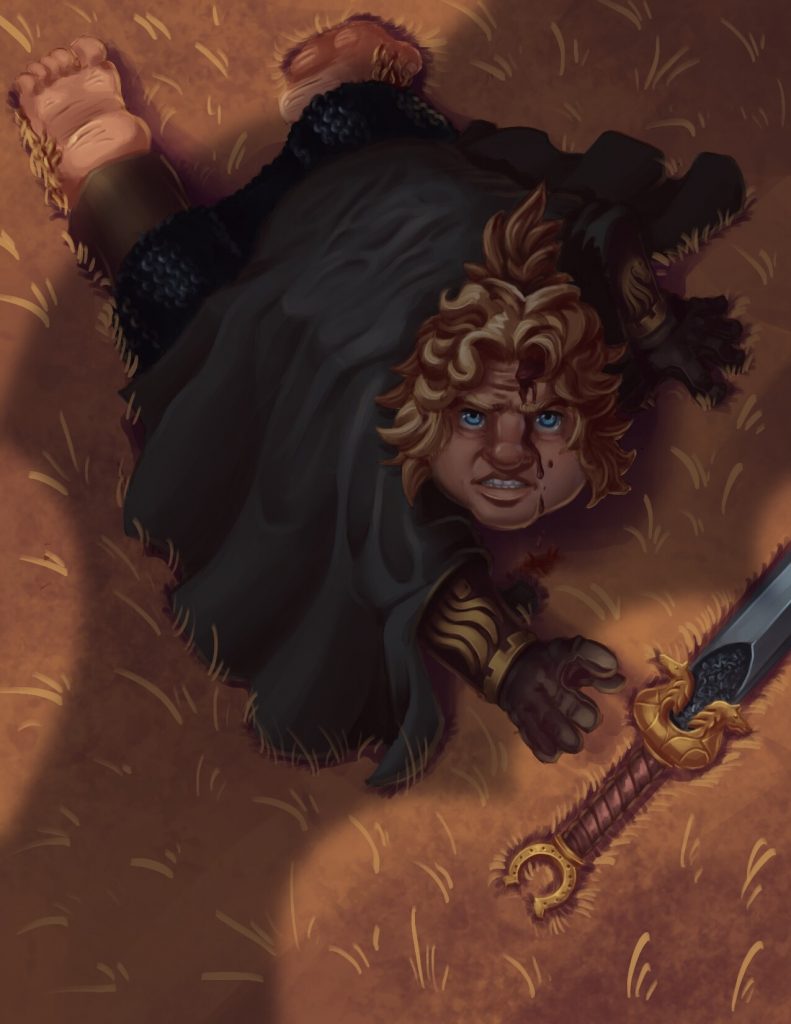
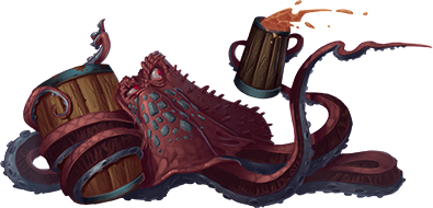
A sampling of Fernando’s artistic styling.
The beauty of tabletop RPGs is that everyone plays them differently, some games are approached in an earnest, grounded way, while other players take a more casual approach full of anachronistic references and 4th wall breaking. I hope that our illustrations will help spark lots of creativity and ideas for your games.
Teamwork
While I want to always provide you with beautiful illustrations, I am aware that art is not what you come here for. The pictures are meant to enhance the content, not steal the spotlight. it’s important that every illustration reflects what the text is conveying; visuals are adjectives, they don’t change the meaning of the message, they help deliver it and help you understand it better.
Matt and I work very closely to make sure that the art reflects his vision. We do this by communicating a lot throughout the day, and being as clear as possible on what we want. Since he does all the layouts and creates all the many other graphic elements he is able to tell me not just what content he’s looking for in an illustration but also the exact dimensions he needs them to be, as well as any elements, colors, or composition that will make it the perfect fit for each page.
I hope to share our process from initial concept to published product in as much detail as I can in the near future, so keep an eye on this space!
